Agency Dashboard
Five views of your agency — from today's schedule to your long-term pipeline — all in one place.
Agency plan — branch filter
On the Agency plan with two or more offices, eligible users see a branch selector above the dashboard. Choosing an office narrows Overview, Weekly View, Listing Health, Agent Performance, and Agency Performance to that branch's data (URLs keep ?branch=). Members scoped to a single branch already work in that context. Full detail: Branches.
What this does
The dashboard is the first screen you see when you open XchangeHero. It has five tabs — Overview, Daily/Weekly, Listing Health, Agent Performance, and Agency Performance — each designed to answer a specific question about your business. You do not need to run any reports; everything updates automatically as you and your team work.
Overview
Your agency at a glance — today's schedule, your live pipeline value, and everything that needs attention right now.
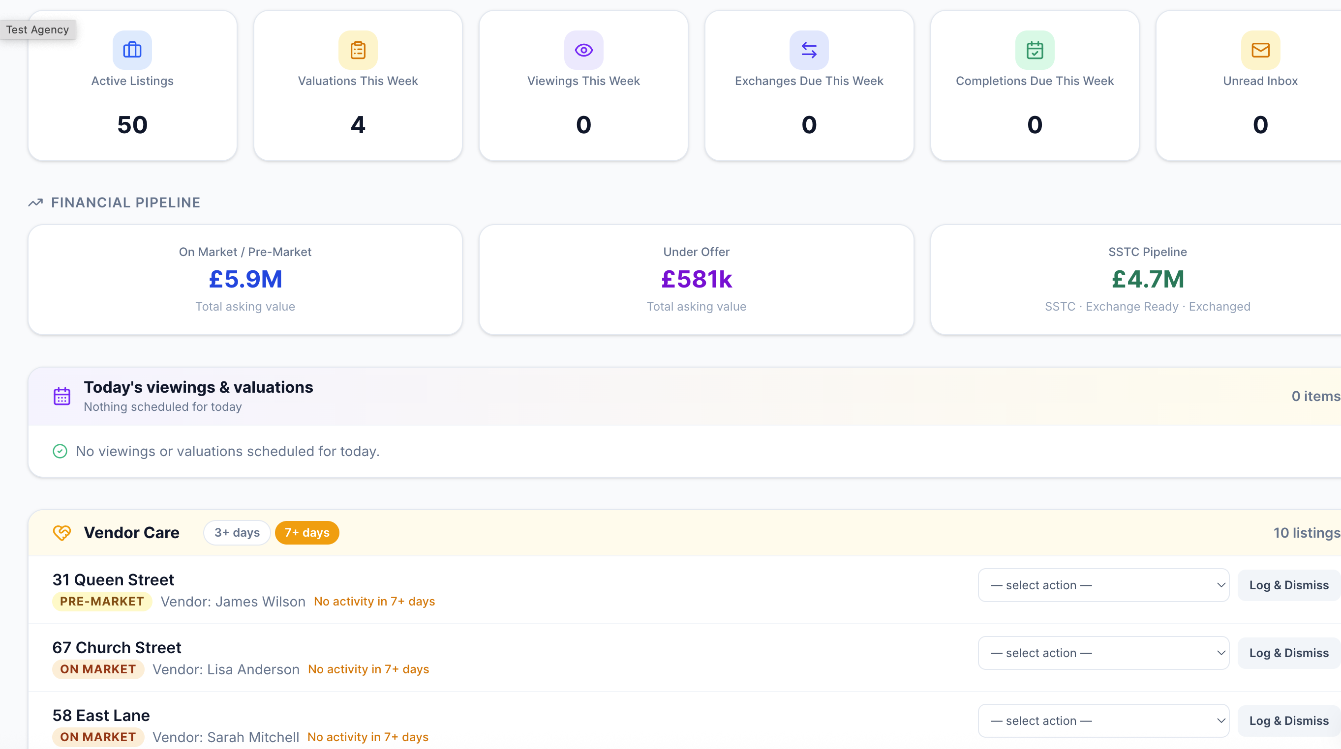
The Overview tab — financial pipeline strip at the top, quick stats, today's viewings and valuations, and the vendor care radar below.
Financial pipeline strip
Immediately below the navigation tabs you'll see three figures that together tell you the total value of business you currently have in play:
These numbers update the moment a deal status changes anywhere in the system — no refresh needed.
Quick stats
Six tiles below the pipeline strip give you instant counts that link directly to the relevant section:
Click any tile to go straight to that section of the app.
Today's schedule
Below the tiles you'll find today's viewings and valuations side by side. Each entry shows the time, address, and the person attending. Outstanding viewings — those with no outcome recorded yet — are highlighted so nothing gets forgotten.
Vendor care radar
The Vendor Care section flags listings that have gone quiet. Any deal with no recorded activity in the last three days — no calls, emails, viewings, or notes — appears here as amber. Deals with no activity for seven days appear as red. The intention is simple: no vendor should go a week without hearing from their agent.
Daily / Weekly View
Everything happening this week — viewings, valuations, exchanges, completions, new instructions, offers received, and buyer matches to action.
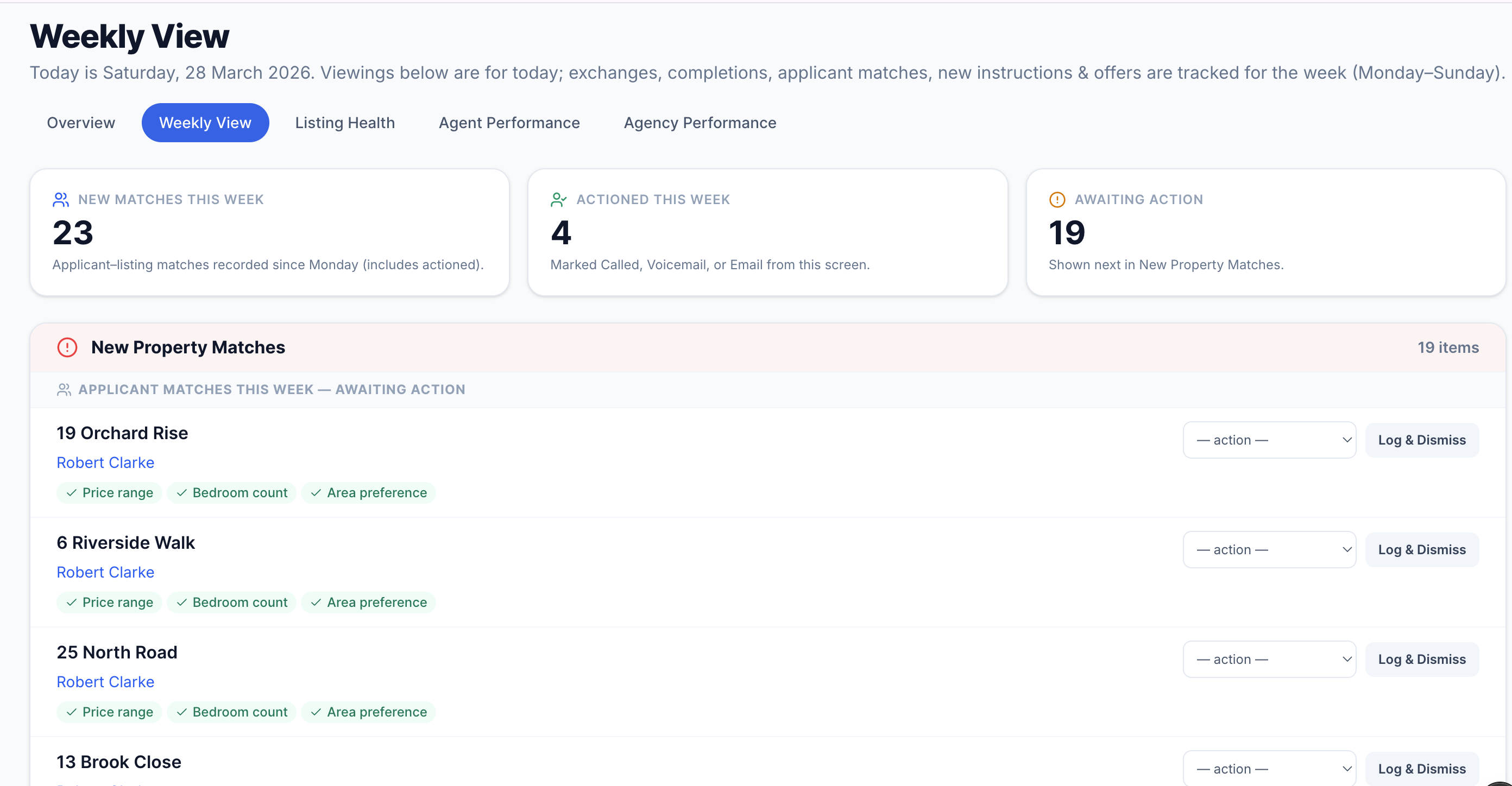
The Daily/Weekly tab — a full picture of the current working week across all deal activity.
This tab is designed to be opened every morning. It shows you the full week's picture so you can plan the day and make sure nothing slips.
Tip
The buyer matches section also shows you at a glance how many matches were actioned versus total — a useful measure of whether your team is following up every lead the system surfaces for them.
Listing Health
Every active listing ranked by time on market — with price history, offer activity, and stale listing alerts.
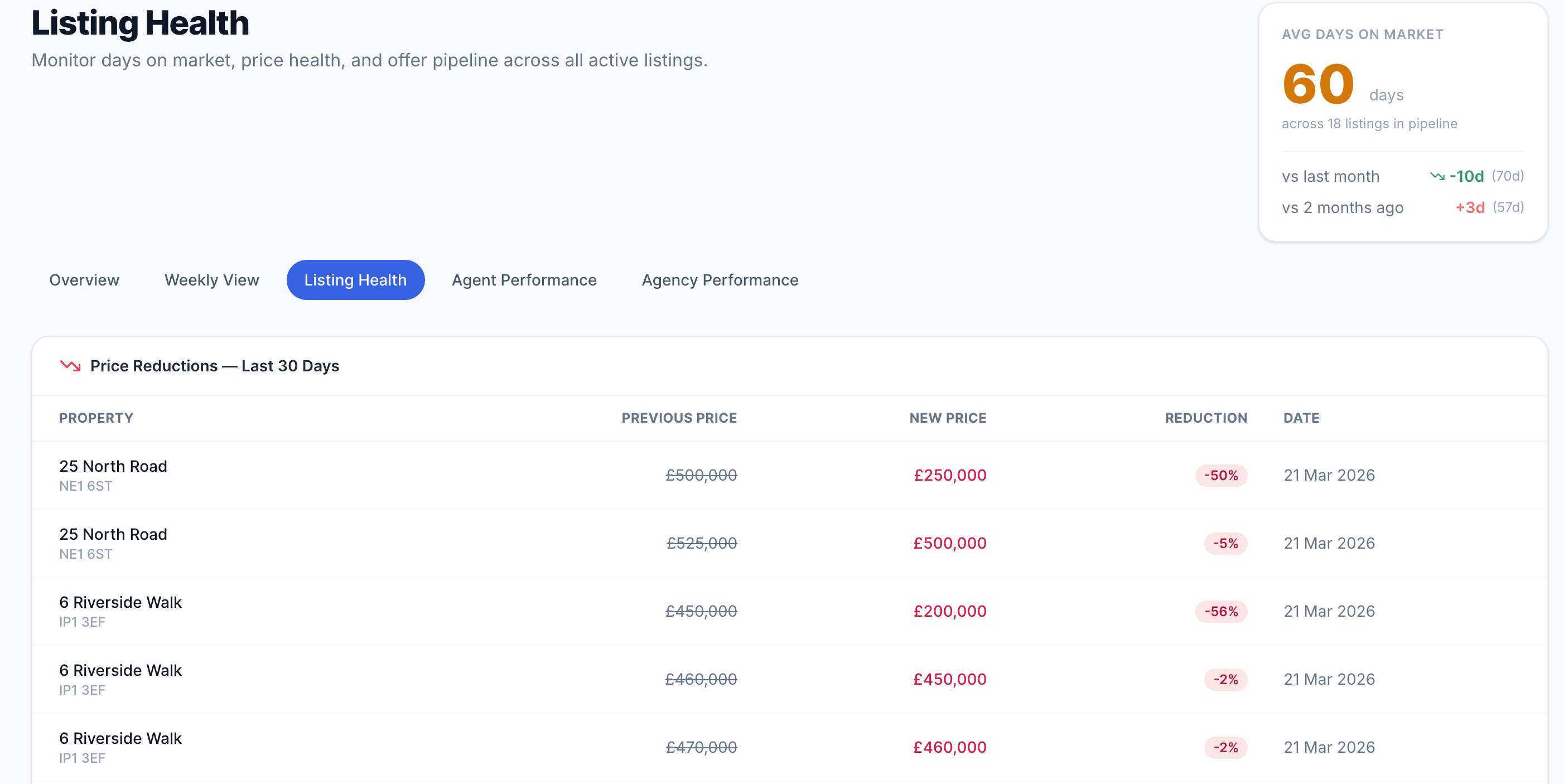
Listing Health — recent price reductions at the top, then the full listings table sorted by days on market with offer counts.
Recent price reductions
Any listing with a vendor-agreed price reduction in the last 30 days appears at the top of this page. For each one you can see the previous asking price, the new price, the percentage reduction, and the date it was recorded. This makes it easy to spot pricing trends across your portfolio — and to ensure each reduction is being followed up with fresh buyer outreach.
The listings table
Every active listing appears in the table, sorted from the longest to the shortest time on market. The columns show you:
The average days-on-market widget in the top-right corner shows the current average for all active listings, compared with one and two months ago — a quick indicator of whether your portfolio is moving faster or slower than it was.
When to use this
Run through the Listing Health tab once a week in your team meeting. Any listing in the red zone — typically 60+ days on market — should have an action: a price review, increased marketing, or a frank conversation with the vendor. This tab gives you the data to have that conversation confidently.
Agent Performance
How each member of your team is performing — viewings, instructions won, buyer match follow-up, and valuation conversion.
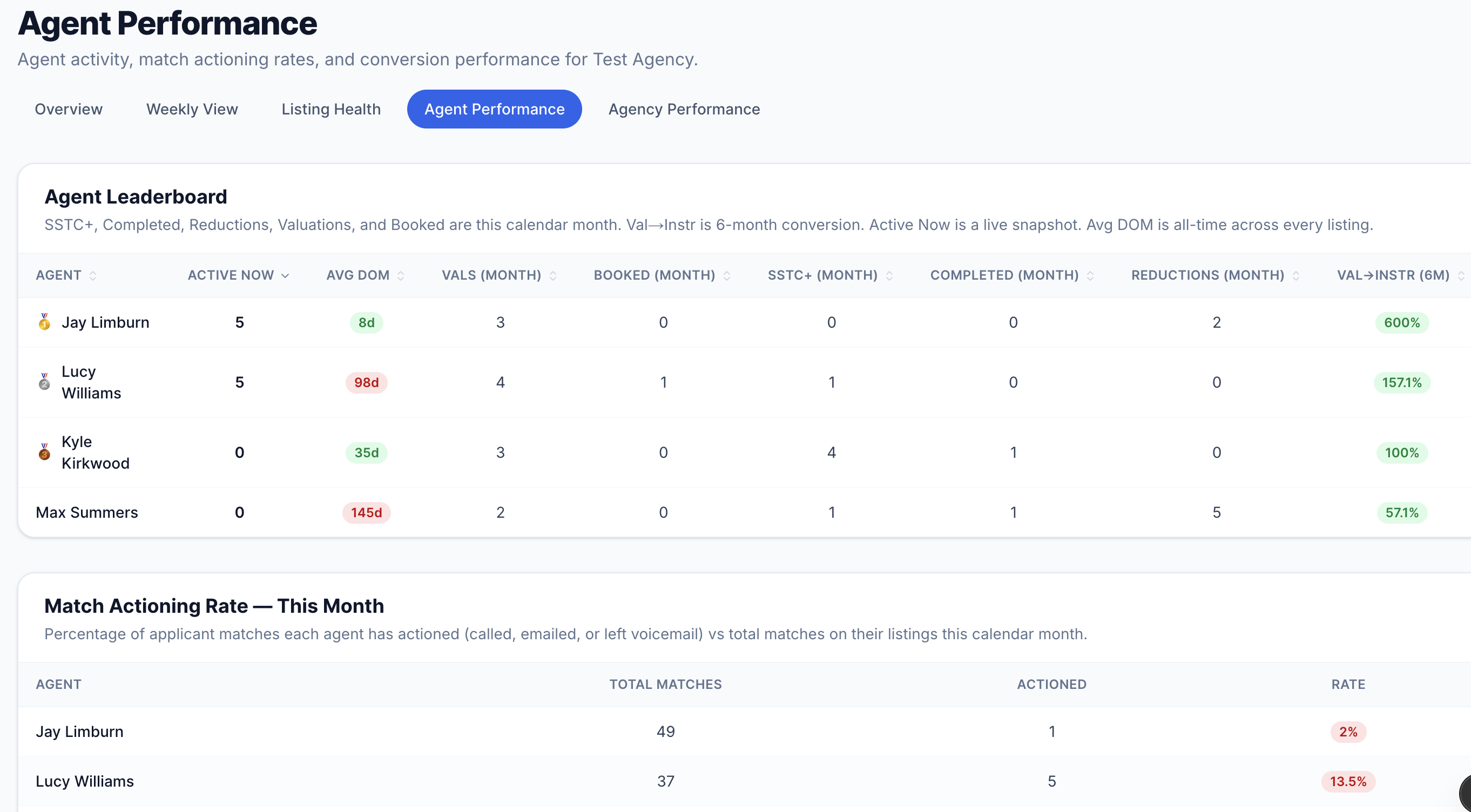
Agent Performance — the leaderboard at the top with individual metrics, match actioning rates below, and trends by month.
Leaderboard
The leaderboard ranks every agent by activity across the last six months. For each agent you can see:
Click any column header to re-sort the table by that metric.
Match actioning rate
This section shows, for each agent this month, how many buyer matches were assigned to their listings and how many of those have been actioned — called, emailed, or noted. The rate is shown as a percentage with a colour indicator:
If buyers are being matched to properties automatically but agents are not following up, this is where that gap becomes visible. Every unactioned match is a potential viewing — or sale — that has been left on the table.
Trends over time
Two charts below the leaderboard show each agent's instruction count and viewing count by month over the last six months — useful for spotting whether performance is trending up or starting to dip before it becomes a problem.
Agency Performance
The commercial picture — pipeline value by stage, how busy the business is week on week, offer analytics, and valuation-to-instruction conversion.
Agency Performance — pipeline value by deal stage, 8-week communication volume, offer analytics, and the valuation conversion chart.
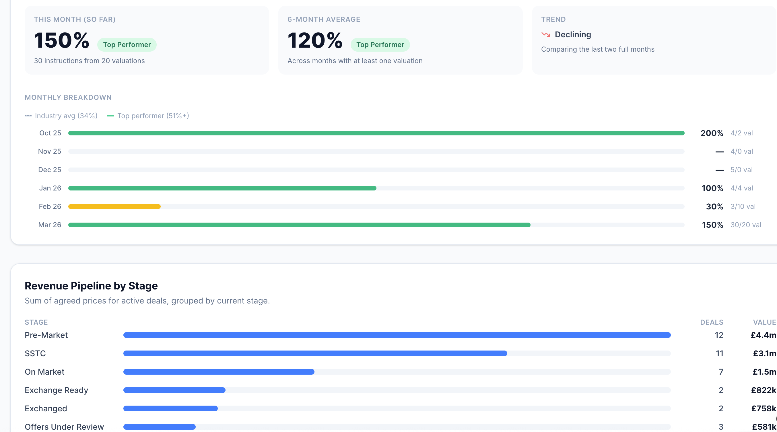
Revenue pipeline by stage
A horizontal bar chart showing the total value of deals sitting at each stage in your pipeline right now. Each row shows the deal stage, the number of listings at that stage, and the combined asking price. This gives you an instant read on where the revenue is concentrated — and which stages are thin.
For example, if you have a strong On-Market figure but a weak SSTC figure, it suggests viewings are happening but offers are not converting. If the Exchange Ready figure is high, you have a lot of fee revenue close to completion.
Communication volume trends
A bar chart covering the last eight weeks, showing how many activity entries — calls, emails, notes, viewings, and system updates — were logged each week across the whole agency. This is a proxy for how busy and proactive the business is.
A sharp drop in one week can indicate a bank holiday, a team absence, or — more usefully — a period where the team fell behind on logging. A consistent upward trend tells you activity is growing.
Offer analytics
Three figures covering offer activity in the last 90 days:
Pipeline velocity & valuation conversion
Below the offer analytics you will find two further charts. Pipeline velocity shows the average number of days deals spend at each stage — helping you identify where deals get stuck. Valuation conversion shows how many valuations turn into instructions each month over the last six months — the single most important measure of business development effectiveness.
Using this in reviews
The Agency Performance tab is built for monthly management reviews. The pipeline value chart tells you the financial state of the business today. The communication trends chart tells you whether the team has been active. The offer analytics tell you whether your pricing is hitting the market. Together, they give you everything you need for a structured performance conversation.
What to read next
- Buyer matching
How matches are generated and how to action them from the Daily/Weekly tab
- Deal progression & chain health
How listings move through the pipeline and how to record offers, exchanges, and completions
- AI Inbox Agent
How the inbox feeds activity into the dashboard automatically
- Prospecting & valuations
The valuation pipeline that feeds the conversion chart in Agency Performance